A half-baked (CSS) idea

Spritebaker has been doing the rounds a fair bit in web development circles over the past few weeks, for the simple reason that it’s a great idea, done well. The best desciption comes from the site itself:

It parses your css and returns a copy with all external media “baked” right into it as Base64 encoded datasets. The number of time consuming http-requests on your website is decreased significantly, resulting in a massive speed-boost.

While baking images into your CSS to lower HTTP requests reduces the rendering time of your site overall, the downside is that CSS files block the initial rendering of your site. While an unbaked site may render and be built up as external images load, a baked site will not render until both the CSS and baked images have loaded. This has the strange effect of making it seem like the page is actually taking longer to load.

I’ve thrown together a quick example of an unbaked page and its baked equivalent. In this example, the unbaked page begins rendering earlier than its baked counterpart but finishes later.

In an attempt to kick off rendering earlier, I tried what I’ve named a half-baked idea: splitting the standard CSS into one file and the baked images into another. My hope was that browsers would render the standard CSS while the other was still loading. As you can see on the example page,  this failed.

With CSS only solutions delaying rendering of the page, it’s time to pull JavaScript out of our toolbox. Anyone whose read my article on delaying loading of print CSS will find the solution eerily familiar. The CSS files are still split into the standard files and the file containing the baked-in images, the one with the baked in images is wrapped in <noscript> tags in the HTML head.

<link rel="stylesheet" href="halfbaked-1.css" type="text/css" />
<noscript><link rel="stylesheet" href="jshalfbaked-2.css" type="text/css" /></noscript>

This prevents the second/baked stylesheet from loading during the initial rendering of the page. Without this file blocking rendering, this version of the example begins rendering as quickly as the first, unbaked, example.

The second/baked stylesheet needs to be added using the JavaScript below:

<script type="text/javascript">
window.onload = function(){
  var cssNode = document.createElement('link');
  cssNode.type = 'text/css';
  cssNode.rel = 'stylesheet';
  cssNode.href = 'jshalfbaked-2.css';
  cssNode.media = 'all';
  document.getElementsByTagName("head")[0].appendChild(cssNode);
}
</script>

Using the method above for baking images into your CSS will give you the best of both worlds, your page will render quickly with a basic structure before a single HTTP request is used to load all of your images.

I used Web Page Test to measure the first-run load times using IE9 Beta, averaged over 10 tests. On the test pages, with only a few images, the advantage of a baked stylesheet isn’t apparent, on a site with more images it would quickly become so.

Version Starts Render Fully Loaded
Unbaked 0.490s 1.652s
Baked 1.862s 1.836s
Half baked 2.138s 2.114s
JS baked 0.499s 1.993s

As the Spritebaker info page says, IE versions prior to IE8 don’t understand data-URIs, so you’ll need to use a generous sprinkling of conditional comments to load images the old fashioned way in these browsers.

The examples above were tested on IE9 Beta, Chrome 6.0, Safari 5.0, Opera 10.10 and Firefox 3.6.9. Individual results may vary.

We’d love to hear of your experiences with baking stylesheets, or other techniques you use to speed up apparent rendering of your page, especially if it slows the total load/rendering time.
Published
Categorized as Code Tagged

Delay Print Stylesheets Plugin

A few weeks ago I wrote a post in which I adapted an idea from a zOompf article to delay the loading of print stylesheets until after a web page has fully rendered. I finished that post with the following point/question:

Another question to ask is whether all this is actually worth the effort – even when reduced through automation. On Big Red Tin, the print.css is 595 bytes, the delay in rendering is negligible.

Chris and Jeff at Digging into WordPress picked up the article and posted it on their site. In turn it was picked up elsewhere and became the surprise hit of the summer at Big Red Tin. Not bad when one is shivering through a bitter Melbourne winter.

As a result of the interest, I decided to convert the code from the original post into a plugin and add it to the WordPress plugin directory.

Further Testing

As I warned in the original article, I’d tested the code in very limited circumstances and found it had worked. Fine for a code sample but not enough for a sub version-1.0-release plugin. Additional testing showed:

  1. Stylesheets intended for IE, through conditional comments, were loading in all browsers
  2. When loading multiple stylesheets, the correct order was not maintained in all browsers

If jQuery was available I wanted to use it for JavaScript event management otherwise I’d use purpose-written JavaScript. There’s no point, after all, of worrying about the rendering delay caused by 600-1000 bytes only to load a 71KB (or 24KB gzipped) file in its place.

Other things I wanted to do included:

  1. Put the PHP in a class to reduce the risk of clashing function/class names
  2. Put the JavaScript in its own namespace
  3. Keep the output code as small as possible

To support conditional comments for IE required adding each stylesheet within a separate <script> tag, using this method the output HTML takes the following form:

<script>
  // add global print.css
</script>
<!--[if IE 6]>
  <script type='text/javascript'>
    // add ie6 specific print.css
  </script>
<![endif]-->

This violates my aim to keep output as small as possible but footprint has to take second place to bug-free. I could have translated the code to use JavaScript conditional comments by translating the IE version to the JavaScript engine it uses but this could lead to future-proofing problems.

To maintain the order of stylesheets, I added each event to an array of functions and then used a single event to loop through the array of functions. If jQuery is used, I add multiple events because jQuery runs events on a first in first out basis.

Putting the PHP in a class and the JavaScript in its own namespace is fairly self-explanatory. Google is your friend if you wish to read up further on this.

Minimising the footprint was also a simple step. I wrote the JavaScript out in full with friendly variable names. Once I was happy with the code, I ran the code through the YUI JavaScript compressor, commented out the original JavaScript in the plugin file and output the compressed version in its place.

The JavaScript is output inline (within the HTML) to avoid additional HTTP requests. I was in two minds about this because browser caching is lost in the process. So it may change in a later version.

I’ve worked out another way to keep the footprint small. Rather than creating a function to pass the stylesheet’s URL and ID to brt_print.add(url, id), I wrote out the full function for each style sheet. I’ll fix that in the next release.

You can download the Delay Print CSS Plugin from the WordPress plugin repository.

Delay loading of print CSS

Recently I stumbled across an article on zOompf detailing browser performance with the CSS print media type. In most recent browsers, Safari being the exception, the print stylesheet held up rendering of the page.

The zOomph article suggests a solution, to load print stylesheets using JavaScript once the page has rendered (ie, on the window.onload event), with a backup for the JavaScript impaired. You can see their code in the original article.

Automating the task for WordPress

Most sites I develop are in WordPress so I decided to automate the process. This relies on using wp_enqueue_style to register the stylesheets:

function enqueue_css(){
  if (!is_admin()){
    wp_enqueue_style (
      'bigred-print', /* handle */
      '/path-to/print.css', /* source */
      null, /* no requirements */
      '1.0', /* version */
      'print' /* media type */
    );
  }
}
add_action('wp_print_styles', 'enqueue_css');

The above code will output the following HTML in the header:

<link rel='stylesheet' id='bigred-print-css'  href='/path-to/print.css?ver=1.0' type='text/css' media='print' />

The first step is to wrap the above html in noscript tags, the WordPress filter style_loader_tag is ideal for this.

function js_printcss($tag, $handle) {
  global $wp_styles;
  if ($wp_styles->registered[$handle]->args == 'print') {
    $tag = "<noscript>" . $tag . "</noscript>";
  }
  return $tag;
}
add_filter('style_loader_tag', 'js_printcss', 5, 2);

The filter runs for all stylesheets, regardless of media type, so the function checks for print stylesheets and wraps them in the noscript tag, other media types are left alone.

The first two arguments are the filter and function names respectively, the third argument specifies the timing (5 is the default) and the final argument tells WordPress how many arguments to pass to the filter – two – in this case $tag and $handle.

With the new filter, WordPress now outputs following HTML in the header:

<noscript>
<link rel='stylesheet' id='bigred-print-css'  href='/path-to/print.css?ver=1' type='text/css' media='print' />
</noscript>

The next step is to add the JavaScript to load the stylesheets, we can do this by changing our original function, js_printcss, and making use of a global variable:

$printCSS = '';

function js_printcss($tag, $handle){
  global $wp_styles, $printCSS;
  if ($wp_styles->registered[$handle]->args == 'print') {

    $tag = "<noscript>" . $tag . "</noscript>";

    preg_match("/<s*links+[^>]*hrefs*=s*["']?([^"' >]+)["' >]/", $tag, $hrefArray);
    $href = $hrefArray[1];

    $printCSS .= "var cssNode = document.createElement('link');";
    $printCSS .= "cssNode.type = 'text/css';";
    $printCSS .= "cssNode.rel = 'stylesheet';";
    $printCSS .= "cssNode.href = '" . esc_js($href) . "';";
    $printCSS .= "cssNode.media = 'print';";
    $printCSS .= "document.getElementsByTagName("head")[0].appendChild(cssNode);";
  }
  return $tag;
}

The code creates the PHP variable $printCSS globally, which is then called into the function using the global command.

After wrapping the tag in the noscript tags, the new function uses a regular expression to extract the URL of the stylesheet from the link tag and placing it the variable $href.

Having extracted the stylesheet’s URL, the function then appends the required JavaScript to the PHP global variable $printCSS.

The final step is to add the JavaScript to the footer of the HTML using the wp_footer action in WordPress. The PHP to do this is:

function printCSS_scriptTags(){
  global $printCSS;
  if ($printCSS != '') {
    echo "<script type='text/javascript'>n";
    echo "window.onload = function(){n";
    echo $printCSS;
    echo "}n</script>";
  }
}

add_action('wp_footer', 'printCSS_scriptTags');

The above code uses window.onload as dictated in the original article. A better method would be to use an event listener to do the work, for those using jQuery we would change the function to:

function printCSS_scriptTags(){
  global $printCSS;
  if ($printCSS != '') {
    echo "<script type='text/javascript'>n";
    echo "jQuery(window).ready(function(){n";
    echo $printCSS;
    echo "});n</script>";
 }

}
add_action('wp_footer', 'printCSS_scriptTags');

The above solution had been tested for very limited circumstances only and found to have worked. Were I to use the function in a production environment I would undertake further testing.

Another question to ask is whether all this is actually worth the effort – even when reduced through automation. On Big Red Tin, the print.css is 595 bytes, the delay in rendering is negligible.

Update Aug 23, 2010: Fixed a type in the code block redefining js_printcss.

Update Aug 27, 2010: I’ve decided to release this as a plugin, get the skinny and the plugin from the followup article.

Rounded Corners Everywhere

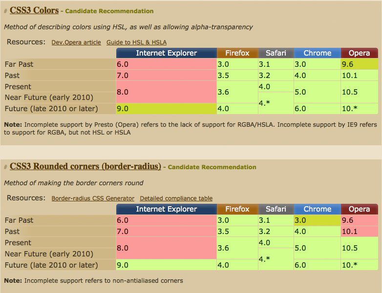
Spending some time looking at CSS3 support on caniuse.com, I noticed how similar browser support for border-radius and rgba colours is:

rgba-vs-border-radius

The striking similarity allows us to use both the old graphical and new css3 methods for rounded corners, giving us the same look in almost all browsers but without wasting the bandwidth of users with modern browsers.

On a previous version of this website, I used this method with the following CSS:

.aktt_widget .aktt_tweets {
  background: #999
              url(10pxrounded-210w-24.png)
              no-repeat top center;

  background: rgba(153,153,153,1) none;

     -moz-border-radius: 10px; /* FF1+ */
  -webkit-border-radius: 10px; /* Saf3+, Chrome */
          border-radius: 10px; /* Opera 10.5, IE 9 */
}

Browsers that don’t support rgba colours use the first background call which includes an image to emulate rounded corners. Browsers that do support rgba use the second background call, which includes a fully opaque colour but no background image, for the most part these browser can interpret the border-radius calls that follow.

This method falls over in Opera 10.1, which displays a square border, and will fall over in IE9, which will interpret the border-radius call and download the image. I don’t see these couple of exceptions as a big problem, as browser support always involves catering to the majority.

JavaScript Equal Height Columns

The desire for equal height columns in a CSS layout is nothing new; there are many solutions available, some use JavaScript, others use CSS with negative margins, and then, there’s the faux columns method using background images. All of these methods have their place as perfectly valid solutions, and, depending on the situation, may be the best solution available.

Review – Everything you know about CSS is wrong!

During the week I read Rachel Andrew and Kevin Yank’s Everything You Know About CSS Is Wrong! At a little over 100 pages it’s a concise explanation of CSS tables and how they will – and an argument why they should – change the way in which web developers work.

EYKACIW! begins by explaining how today’s web developer has hacked CSS to do things it was never designed to do, in much the same way that we hacked HTML tables in the heady days of the 1990s; floats, faux columns, negative margins, positioning, and, several more tricks now used as a second nature all get dishonourable mentions.

Published
Categorized as General Tagged

Don’t start with a reset.css

Earlier this year, Jonathan Snook wrote an article on why he doesn’t use a reset.css in which he referred to Eric Meyer’s reset, a short time later, Eric Meyer responded with an article of his own. Unlike many discussions on the web, it wasn’t a mudslinging match, but a sincere discussion of the tools available to web developers.

My initial thoughts were that a reset style sheet, combined with a base style sheet, was a helpful place to start any web project as it reduces the incidence of unexpected results. I thought it was important for the developer to have her own reset and base styles; blindly adopting someone else’s reset and base style sheets will just lead to a different set of surprises.

Published
Categorized as Code Tagged