Category: Blog

  • ‘Skip to Content’ Links

    Big Red Tin co-author, Josh, and I were discussing the positioning of Skip to Content links on a website. In the past I’ve placed these in the first menu on the page, usually positioned under the header.

    According to the fangs plugin, the JAWS screen reader reads the opening of Soupgiant.com as:

    Page has seven headings and forty-three links Soupgiant vertical bar Web Production dash Internet Explorer Heading level one Link Graphic Soupgiant vertical bar Web Production Heading level five Heat and Serve Combine seventeen years of web production experience, twenty years of television and radio experience, put it all in a very large pot on a gentle heat. Stir regularly and serve. Soupgiant goes well with croutons and a touch of parsley.List of five items bullet This page link Skip to Content bullet Link Home bullet Link About bullet Link Contact bullet Link Folio

    – my emphasis

    That’s a lot of content to get through, on every page of the site, before the Skip to Content link. It would be much better if the skip to content link were earlier on the site.

    As the HTML title of the page is read out by JAWS, the best position would be before the in-page title. The opening content would then read as:

    Page has seven headings and forty-three links Soupgiant vertical bar Web Production dash Internet Explorer This page link Skip to Content Heading level one Link Graphic Soupgiant vertical bar Web Production

    – again, the emphasis is mine

    That gives the JAWS user the title of the page and immediately allows them to skip to the page’s content. I don’t read the header of on every page of a site, nor should I expect screen reader users to.

    I realise screen readers most likely have a feature to skip around the page relatively easily, regardless of how the page is set up but our aim should not be relative ease, our aim should be absolute ease.

    As a result, we’ve decided to move the skip to content links on future sites to earlier in the page.

    Sadly, this revelation came up as a result of what I consider to be a limitation of the WordPress 3.0+ function wp_nav_menu, the inability to add items at the start of the menu. I should have considered the accessibility implications much earlier. It serves as a reminder, to all web developers, that we should constantly review our practices and past decisions.
  • Blog Post: This Tweet Looks Unloved

    Any blogger worth their salt knows of Twitterfeed or a similar service. For the uninitiated, Twitterfeed converts a site’s RSS feed into tweets, allowing users to set and forget. The auto-tweets take the form ‘Blog Post: <title> <short url>’ or similar.

    When we launched Big Red Tin we didn’t set up Twitterfeed immediately.

    With manual tweets we could customise the message to provide more details to Twitter users, one such tweet was:

    We had Twitterfeed set up at this blog’s old location and took the opportunity to compare click-throughs from manual tweets versus automated tweets.

    Manual tweets had a substantially higher click-through rate than the automated tweets. I suspect the reason for this is two fold:

    • With so many people using Twitterfeed type services, Twitter users have learnt to ignore tweets that appear auto-generated.
    • More information can be included in a manual tweet than might appear in an auto-tweet.

    Take the post we were linking to earlier, had we been using Twitterfeed the tweet would have been ‘Blog Post: Web 1.5 http://redt.in/b0KRut‘. This provides so little information as to be next to useless. We would have ignored such a tweet out ourselves.

    Many of the posts on this site are scheduled in advance, this allows us to publish at roughly the same time each week.

    To schedule the associated tweets we use CoTweet. We have a couple of shared twitter accounts as it is, so CoTweet comes in handy for other purposes, but it’s the scheduling feature we use most of all.

    If you use Twitterfeed yourself, try disabling it for a couple of weeks and manually tweet in its place. There’s a good chance you’ll be pleasantly surprised when you compare your bit.ly stats.

  • Surprise. It’s all about honesty

    Last week we had a sales meeting with a potential client. As it turned out, we were unable to help with the task they had in mind. It was outside our area of expertise.

    We may have been able to fudge it. Call us stupid, but we don’t think ‘fudging it’ is the way to keep clients happy or maintain a low client turnover.

    In this situation there are two options:

    1. Quote ludicrously high with the aim of missing out on the job. In the event the quote is accepted, the job can be outsourced with a tidy profit.
    2. Tell the truth and decline the work

    We chose the latter option and used the opportunity to explain our areas of expertise. Selling the company, not the lie.

    The natural fear is the potential client will storm out of the meeting, muttering obscenities under their breath.

    What actually happens is the potential client realises their current project – or at least the original part of their current project – is a bad fit. They also realise they’re not dealing with sleazy salesmen willing to say anything to get a job and deal with the consequences later.

    The second realisation sells a company. It’s something that can be used to convert a single project into a long term relationship.

    Ludicrously high quoting, lies or fudging a task may get you more clients but getting clients isn’t the aim, the real aim is to keep them.

  • Web 1.5

    The brief for Big Red Tin and its redesigned sister site, Soupgiant, included a couple of notes for our very patient designer, Christa at Zepol:

    The frame of both sites will be pretty similar. We were thinking of different colour schemes […] as a way of demarcating the two sites.

    We haven’t got an exact style in mind, but something relaxed and modern without going over the top – Web 1.5 if you like.

    — source: email to Zepol (emphasis added for this post)

    The rest of the brief detailed the content separation between Soupgiant and Big Red Tin. We wanted the design to come from the designer to fit the content, not from a committee to fit some other agenda.

    In the context of this site’s design, the exact interpretation of Web 1.5 was left to Christa’s devices. As should the exact interpretation of any design brief.

    To me, web 1.5 means something like: dump all the cliches of Web 2.0 design, at the same time keep the good bits

    “A good bit” may be a feature that is used frequently, such as oversized footers, because it adds something for users of the site. Cliches are those design tricks that add nothing but appear on every second web site, such as elements with faded backgrounds and rounded corners.

    It strikes me, as a developer, it must be said that the definition of design is something similar: dump all the cliches and keep all the good bits

    Failing to do so risks rendering you a regurgitator, not a designer.

  • Valid Isn’t Best Practice

    Long ago, on the @soupgiant account, I tweeted:

    While neither the xHTML nor the CSS on this site validates, we consider it to observe best practices. (more…)

  • JavaScript the WordPress Way / Part 2

    In Part 1 we discussed the conflicts that can occur on a WordPress site if themes and plugins add JavaScript using <script> tags. We introduced the wp_register_script and wp_enqueue_script functions developed to avoid these conflicts.

    In this section we’ll deal with a more complicated example and use Google’s AJAX libraries API to lower your bandwidth costs. We’ll also take what we’ve learnt about including JavaScript and apply it to our CSS. (more…)

  • JavaScript the WordPress Way / Part 1

    Two of the most important WordPress functions are often ignored by WordPress theme and plugin developers. This is the fault of the functions themselves, they need to improve their PR and hire better publicists.

    It’s also possible your theme or plugin will work perfectly well without these functions on its own. Problems will arise when your theme or plugin both use the same JavaScript library or if Prototype and jQuery are both used on the same site.

    These functions are used to add JavaScript to the html, either in the head or the footer.

    Introducing wp_register_script and wp_enqueue_script (more…)

  • Rounded Corners Everywhere

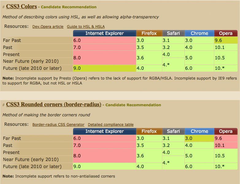
    Spending some time looking at CSS3 support on caniuse.com, I noticed how similar browser support for border-radius and rgba colours is:

    rgba-vs-border-radius

    The striking similarity allows us to use both the old graphical and new css3 methods for rounded corners, giving us the same look in almost all browsers but without wasting the bandwidth of users with modern browsers.

    On a previous version of this website, I used this method with the following CSS:

    .aktt_widget .aktt_tweets {
      background: #999
                  url(10pxrounded-210w-24.png)
                  no-repeat top center;
    
      background: rgba(153,153,153,1) none;
    
         -moz-border-radius: 10px; /* FF1+ */
      -webkit-border-radius: 10px; /* Saf3+, Chrome */
              border-radius: 10px; /* Opera 10.5, IE 9 */
    }

    Browsers that don’t support rgba colours use the first background call which includes an image to emulate rounded corners. Browsers that do support rgba use the second background call, which includes a fully opaque colour but no background image, for the most part these browser can interpret the border-radius calls that follow.

    This method falls over in Opera 10.1, which displays a square border, and will fall over in IE9, which will interpret the border-radius call and download the image. I don’t see these couple of exceptions as a big problem, as browser support always involves catering to the majority.

  • Confirming a caller’s identity

    The ATO called me last week and asked for my middle name and date of birth to confirm my identity. I told the operator that I wasn’t in the habit of giving out my personal details to incoming callers.

    Rather than try to convince me that anyone could answer my mobile phone, the operator agreed it would be foolish to give out such details. He gave me his extension number, and a phone number where I could verify he was from the tax office.

    Being the cynical sort, or paranoid (I’ll let you decide), I googled the ATO’s website to confirm the number. It was legitimate. I called back and reconnected to the operator immediately. The entire process took less than 30 seconds.

    It got me thinking: Googling ‘<number> site:ato.gov.au’ in hope the ATO had slipped up and the non-public number was on their website was an inefficient step.

    A more efficient way to confirm the number would be for the operator to give out an ATO URL: ato.gov.au/<number> being the logical choice. At the URL, there could be a short message informing the visitor that the number is an ATO phone number. Robots.txt would be used to exclude search engines from indexing that URL.

    It’s a simple fix that costs the ATO very little and protects them and their tax payers.

  • 10 Ways to Draw Traffic to Your Site

    Once you’ve started your site, your blog, or real time web app, there’s no point publishing and just hoping people will come. With that in mind, let me present ten ways to increase your visitor numbers.

    1. Top Ten Lists

    Create spurious top ten lists for an immediate spike in traffic. 24 hours later, you can go into Google Analytics and get a warm fuzzy feeling as your visitor numbers increase. It’s best to ignore bounce rate, and average time on site.

    While your first time visitor numbers have increased, it’s unlikely that many of them will convert to regular visitors or subscribe to your RSS feed; but that was never the goal. The goal was to increase your visitor numbers: always handy for boardroom presentations.