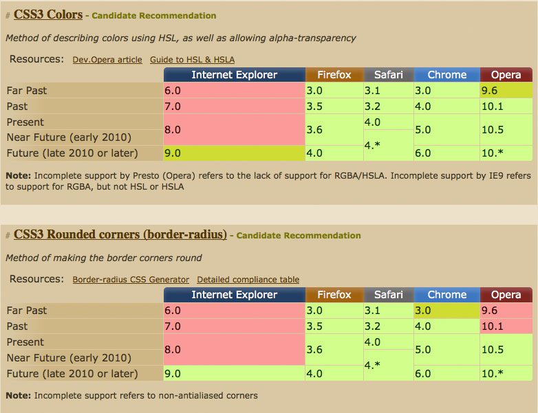
Spending some time looking at CSS3 support on caniuse.com, I noticed how similar browser support for border-radius and rgba colours is:

The striking similarity allows us to use both the old graphical and new css3 methods for rounded corners, giving us the same look in almost all browsers but without wasting the bandwidth of users with modern browsers.
On a previous version of this website, I used this method with the following CSS:
.aktt_widget .aktt_tweets {
  background: #999
              url(10pxrounded-210w-24.png)
              no-repeat top center;

  background: rgba(153,153,153,1) none;

     -moz-border-radius: 10px; /* FF1+ */
  -webkit-border-radius: 10px; /* Saf3+, Chrome */
          border-radius: 10px; /* Opera 10.5, IE 9 */
}
Browsers that don’t support rgba colours use the first background call which includes an image to emulate rounded corners. Browsers that do support rgba use the second background call, which includes a fully opaque colour but no background image, for the most part these browser can interpret the border-radius calls that follow.
This method falls over in Opera 10.1, which displays a square border, and will fall over in IE9, which will interpret the border-radius call and download the image. I don’t see these couple of exceptions as a big problem, as browser support always involves catering to the majority.